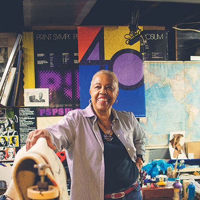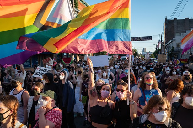
In her Pittsburgh Center for the Arts Artist of the Year exhibit, Exploration of Color, Jo-Anne Bates focuses on the mono print: a one-of-a-kind piece. The exhibit is beautiful and joyful as you enter the gallery, filled with color and unique abstract shapes. Each piece is individual down to its form and surface.
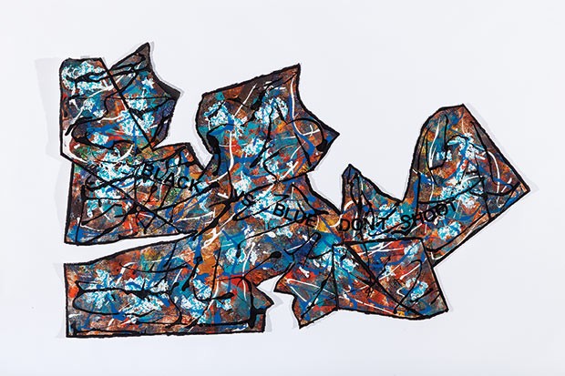
Bates plays with depth by creating hills of shredded paper pulp, thick palpable lines of paint, and matte two-dimensional blocks of color that trick the eye into seeing folded edges. Each print has a phrase or sentence written across it, and the placement of this text also varies; sometimes it reads straight across, sometimes it requires the reader to jumble the words into their proper order. In certain pieces, the text is the first thing the viewer notices, such as “True Beauty,” which allows the words to influence how the viewer approaches the object. Others, such as “My Pride is Black Pride,” require the viewer to really stare at the image and first develop a familiarity with the form before discovering its relation to text. This variation in viewer approach and imagery made the show incredibly exciting to experience.
Placed alongside one another, circling the walls of the gallery, the pieces create a stunning tableau. Bates cites a trip to South Africa as inspiration for her exploration of color, and her desire to mimic that landscape is exhibited in her map-like pieces, which have veins of color running like roads and jagged edges akin to territory and river boundaries.
Some of the shapes suggest abstracted human figures, forming portraits against which their colors and text are framed, especially “Destiny” and “All That Glitters Ain’t Gold.” The shapes are amorphous enough that they are open to many interpretations, and allow viewers to project their own understanding of the language and color onto the shape itself.
Bates’ works are effective and moving because she blends the personal with the political. One that spoke to me was “True Beauty,” which I read as a comment on the pressures of femininity and womanhood. The core colors of the piece are bubble-gum pink and lavender purple, colors associated with little girls and princess dresses, but the pink is distorted. This piece has the most pronounced visible paper shreds. Instead of forming into mounds, the shredded areas burst out of the lines of the shape, perhaps representing the rupturing of expectations or the fracturing of individuals under the pressure of “Real Beauty” standards.
Bates plays with language in multiple ways; the typed print that stretches across each of her prints incorporates language from the Black Lives Matter movement, from media and news sources, and from everyday moments. She cites grandmotherhood as one of her inspirations, and incorporates language and concepts ranging from the intimate and personal to the broad and political. One piece whose language really stands out is “Black on Black in Black.” It is one of two prints that are entirely black, though not at all uniform: the color varies depending on the surface it inhabits, highlighting the furrows and mounds of the shape. The piece is beautiful to look at, and pulls the viewer in to explore all of its nuances. Its words mimic language often used to describe, and callously dismiss, violence in black communities.

Bates’ process also explicitly disrupts language by using shredded texts to form the textures in her work. Not only is the legible text pasted over the surface often subversive and always relevant, but the surface itself deconstructs language as well.
Bates has been a Pittsburgh-based artist and arts educator for many years. She has won numerous awards for her print works and is a member of several local artist organizations. She has been both a teacher and a faculty coordinator for the Pittsburgh Public Schools (notably at the Pittsburgh High School for the Performing and Creative Arts), and creates opportunities and inspiration for her students. She was chosen as the PCA’s Artist of the Year in recognition of the significant impact of her work as well as her contributions to the artistic life of Southwestern Pennsylvania. The work in Exploration of Color was created for this show.
Make sure not to miss this exhibit, and while you’re there, pop upstairs to see an exhibit by Women of Visions, Inc., one of the organizations to which Bates belongs. The exhibit includes more pieces by Bates, and a mockup of her workspace and process that show the shredded paper and texts she uses so well.